Inspiration, the ethereal muse that artists and creatives everywhere hope to encounter, often comes knocking when you least expect it. For Phil Imbriano, a senior designer at Topps, that moment arrived in the unlikeliest of places: the rattling, rush-hour chaos of a New York City subway. As the train hurtled through dimly lit tunnels, his eyes latched onto a seemingly ordinary red-and-silver badge tucked away in a corner of the car. But to Imbriano, it wasn’t just a badge; it was the spark for something extraordinary.
Within the confines of the hulking metal subway car, an idea bloomed. Imbriano, quick on the draw—of his phone, that is—snapped a photo. By the time he stepped off the train and into the fluorescent glow of the Topps office, the seeds of the 2025 Topps Series 1 baseball cards had begun to sprout within his mind. And today, these very cards are launching, ready to find a home in shoeboxes and binders across the world.
“I love drawing inspiration from everyday things,” Imbriano mused, reflecting on the genesis of his latest creation. “It could be a building, a sign—just something that catches my eye. I take pictures and refer back to them later. You never know when something simple will turn into something big.” And big it became. Now, that subway badge-influenced design, with its fluid lines reminiscent of speed and motion, makes its mark on the Topps legacy.
The new design exudes a playful flirtation with the past, its two bold, sweeping lines sashaying up the left side and across the top of each card. To keen-eyed collectors, this will ring a bell, drawing parallels to the beloved 1982 Topps set. Yet, this wasn’t a planned homage. Imbriano’s vision initially harkened back to the woodgrain aesthetics of 1962 and 1987. “The ’82 connection was a happy accident,” he confessed. “But I think it works because it blends vintage style with a modern twist.”
Before any design is enshrined in print, it must first run a gauntlet of scrutiny. At Topps, the process is nothing less than fierce. Designers unleash their creative prowess, submitting their concepts to a competitive in-house review process. Imbriano’s design triumphed over a flurry of over 20 submissions, navigating through multiple rounds before emerging as the champion. In this horse race of creativity, sometimes even non-winning elements find their way into future series—a testament to the evolving nature of design.
After that eureka moment on the subway, Imbriano sculpted around ten variations, refining each one until the final design hit the sweet spot. “There’s so much that goes into this process,” he remarked. And indeed, for those who cherish these cardboard treasures, few realize the ocean of effort that spills into creating them.
Once digital fingers have done their dance across the canvas, the tangible world beckons. Topps transitions from screen to prototype, crafting physical incarnations of the designs. Holding a prototype offers an indispensable glimpse into the card’s allure and tactile narrative. Clay Luraschi, Topps’ senior vice president of product, emphasized this pivotal step: “When we’re down to the final five designs, we actually print them out and simulate opening a pack,” he explained. “It’s a long, competitive process, and it’s one of the biggest debates we have in the office all year.”
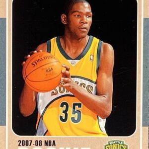
Beyond choosing the foundations, there’s always an element of nostalgia and celebration woven into each series. Beyond the base design, Topps Series 1 decks the halls with a bevy of crowd-favorite subsets. From the glimmering futures celebrated in “Future Stars” to echoing the achievements in “Call to the Hall,” these cards keep the spirit of baseball alive. Dodgers fans can expect a special treat: base-card variations spotlighting jubilant moments, including Freddie Freeman’s signature celebratory dance.
Not to be overshadowed, 2025 marks a celebratory nod to the bold tones of the 1990 Topps series, a set known for its chromatic bravura. Imbriano likens his design approach to crafting a cinematic poster, each card meant to captivate like a mini cinematic scene in a collector’s hands. It’s this ethos of timelessness that guides him. After all, shouldn’t a card serve as a time capsule, instantly recognizable decades down the line?
As the crimson and silver hues from a New York subway ride transition from imagination to reality, a new chapter in the storied Topps saga begins. It’s a testament to the unpredictable wellspring of inspiration that even amidst the clangor of a subway, artistry can flourish. For Phil Imbriano and Topps, this journey from subway serendipity to iconic card design epitomizes the harmony of past, present, and the endless canvas of possibility famously offered by America’s favorite pastime.